Neutron Star reader mode feedback

Aurich

Director of Many Things
37,478
Ars Staff
Launching Neutron Star as a sub reading mode for the redesign was a bit of an experiment. Now that it's been live for a week+ (and the new more dense List view is live) we'd love to start gathering feedback from people on how it's working, and how it could be improved.

One thing we're aware of is it's currently not working as well as it could be on mobile. For desktop the ability to use the keyboard to navigate means you can kind of fly through the opening and closing of the preview, mobile not so much.

Would it make sense for mobile to just click through, no preview, while desktop remains the same?

Do you use the keyboard nav?

Just let us know how it's feeling general.
 

Lelitu_Sdrassa

Ars Centurion
237
Subscriptor
I've been experimenting with all the views, and so far Neutron star via mouse is my favourite.
I primarily read ars on desktop, partial screen with an ultrawide, and the responsive design is working nicely there.

It would be nice to be able to skip the article preview on double click when using neutron star with mouse.
Keyboard works well.
 
  • Like
Reactions: jmarlin

Defenestrar

Senator
15,159
Subscriptor++
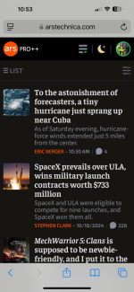
Couple of thoughts. Neutron Star is currently less dense than List for me on mobile. Maybe bring the title font to the same as list size?

List:
1728685090586.jpeg
Neurton:
1728685062510.jpeg
I do like being able to expand and collapse the story openings in Neutron Star mode. It wasn't immediately obvious that I could recollapse the summary by tapping anywhere rather than scrolling back up to the title, but once I figured that out it was much easier to navigate.

Also, if we're going to keep an indent rather than a tight wrap of the category icon, then how visually disturbing would it be to stack the primary story graphic as the same size thumbnail under the icon? I'm visualizing it in my head, but I can't decide if I like what I see. Accidentally missing some clever custom art might be one reason to avoid this mode.
 

Ishkabibbel

Ars Praefectus
3,370
Subscriptor
I found Neutron Star easier to use on mobile. The density seems more appropriate there and I found it easier to parse, probably because each headline took up 2-3 rows. On mobile it would be a toss up with Classic mode if Neutron automatically showed the first three paragraphs of the article (which I like). I appreciate the ability to preview the first three paragraphs without loading the full story.

On Desktop, it's so dense as to be intimidating, in the same way that the iOS Calendar List view was. Great in theory just . . . hard to parse in a meaningful way. I'm probably not among the majority here, but a dividing line or a bit more space would be welcome.
 
  • Like
Reactions: mgc8

mgc8

Ars Praetorian
414
Subscriptor++
First of all, thank you for taking user feedback into consideration, much appreciated!

Neutron Star had become my favourite way to view the site, which I read (a lot!) exclusively on mobile. I think the new List view is much too small and cramped on mobile now, with all that wasted space under the article images (why not allow the text to flow into that space?). I do miss the article images, and would second the suggestion of a tiny thumbnail the size of the icon. If not that, then at least place it in the expanding preview?

Talking about the preview, I really like that feature, and it's saving me a lot of time when it comes to articles that I may have a passing interest in but don't care enough about to dive right in. If the article is not burying the lede that is, but your reporters are usually better than that 😉 Please keep it as is (or allow an option to).

Being exclusively on mobile, I don't care about the keyboard navigation at all, but I can see how that would be useful for people on desktop -- perhaps have a site-wide solution?

Slightly unrelated, one thing that was driving me insane in this redesign was the auto-hiding (and especially auto-showing) header bar, the slightest scroll made it flip in and out like mad! It's not mentioned in the "release notes", but I can feel you've done something to tweak that sensitivity, making it much more tolerable now. Thanks!
 
  • Like
Reactions: Crazymech

AdrianS

Ars Tribunus Militum
2,365
Subscriptor
I am currently using neutron star on mobile, as it was the only view that showed any meaningful amount of data on mobile when the redesign went live.

I like it.
Personally, I'd prefer if the click to expand showed the whole article including the image.

My previous usage was to read the front page, and open each article in a new tab.
That still works, but I would prefer neutron's expanding article, if I didn't have to click again to see the whole thing.

Don't forget that keyboard shortcuts are almost totally useless on mobile, because you have to bring up a keyboard first, which is not the easiest thing on Android, and adds another layer of frustration.
 

zaco

Wise, Aged Ars Veteran
140
Subscriptor
I really like the look of neutron star more than I thought I would. Especially its lack of images on the home page. Great work!

I think there could be some improvements on the flow of getting to the full article. First is the case of when I definitely want to read the full article, I expand, scroll down, tap read full story. Then the preview collapses and there is a bit of a pause before the full story opens. If I haven’t read the preview then it feels cumbersome to get directly to the full story. And sometimes it gives me the impression that I didn’t tap on the link correctly and just collapsed the preview.

Even on desktop, with the keyboard shortcut, the preview folding back feels like a bit of a speed bump.

In the second case, of where I do read the preview first, there is a bit of a refinding where I was in the article after it loads.

My suggestions would be to make it a bit more streamlined to get to the article. A link at the top of the fold-out would be nice. I think a small right pointing arrow-like icon next to the comments icon would work great. This could take you to the top of the article page. While the read full story link after the preview could take you to an anchor point after the third paragraph. That sounds a bit more difficult to implement but it would be a nice streamlining.

Alternatively, I would probably be happy without the foldout behavior at all and just getting to the full story on one tap/click. Maybe a user specific preference could do this.
 

aveius

Seniorius Lurkius
2
Subscriptor++
I've used Neutron Star (NS) exclusively since the redesign launch! Of all places, on mobile Firefox.
Initially tried NS as the List view (my previous favourite) had the infamous density issue, I've immediately liked NS for the article previews and it's now my primary way of browsing the site.
Browsing through the NS list, I can quickly expand and read any excerpt of articles that catches my attention. Gives me a chance to decide if I want to read further – and just like before with the List, I can still easily open articles in a new tab to fully read later with the comments.

I do like where NS is now (thanks for making it!) though would welcome smaller text / more density (20-30%?) across the board.

There seems to be confusion about where NS' value is:
  • For me it's previews, and I'd be happy if the List offered the same feature (as an option?).
  • For others it seems to be a slightly cleaner List with no thumbnails – IMO a minor difference even if I slightly prefer the category icons in NS (again, could be a List option instead?).
  • For others still, the keyboard navigation (Which I find quite nice as an option and may use on desktop)
And indeed it's ironic to have a "super dense" moniker for something now slightly less dense than the List view on phones which might contribute to the reader mix-up. Example from here:
Screen Shot 2024-10-12 at 12.41.09.pngScreen Shot 2024-10-12 at 12.41.24.png

One more note re the infamous font size debate – the NS previews' font is actually slightly smaller than on full articles (computed font-size = 18 vs 20px):
Screen Shot 2024-10-12 at 12.42.57.pngScreen Shot 2024-10-12 at 12.42.58.png
Overall I'd prefer fonts a bit smaller than either but just noting the NS inconsistency.
 

aveius

Seniorius Lurkius
2
Subscriptor++
It would be nice to be able to skip the article preview on double click when using neutron star with mouse.
Personally, I'd prefer if the click to expand showed the whole article including the image.
Alternatively, I would probably be happy without the foldout behavior at all and just getting to the full story on one tap/click. Maybe a user specific preference could do this.

Note the article headers are still links, even if hitting them open the preview. Middle-clicking on them (or Ctrl+click, or long-press on mobile) opens the article in a new tab, which is the same behaviour as the L in keyboard navigation. That might do what you want?

If you don't care about the previews, do you just want the behaviour of the List view but with the look of Neutron Star?
 

AdrianS

Ars Tribunus Militum
2,365
Subscriptor
Note the article headers are still links, even if hitting them open the preview. Middle-clicking on them (or Ctrl+click, or long-press on mobile) opens the article in a new tab, which is the same behaviour as the L in keyboard navigation. That might do what you want?

If you don't care about the previews, do you just want the behaviour of the List view but with the look of Neutron Star?

As stated earlier, pre v9 that's how I used Ars - open each link in a new tab.
I'll try how list works now that it's apparently useable on mobile.
 
  • Like
Reactions: Baenwort

Quinctius

Seniorius Lurkius
5
Subscriptor
I like Neutron Star very much on desktop because of the clean, dense, text-heavy interface as wll because of the keyboard navigation, which is growing on me. I find the preview feature useful to have - if I don't want to see a preview, I bypass it by right-clicking the headlin and opening the story in a new tab. I can't think of anything that I would like changed on the desktop interface. It's an excellent new feature - thank you for creating it.

I think it's promising on mobile, but it is currently less dense than the updated list view, so I find myself using list view more. If they were equally dense, I'd probably be drawn to Neutron Star because the cleanness of the interface appeals to me.
 

Scintillant

Smack-Fu Master, in training
50
Subscriptor++
Echoing what others have said, I read Ars exclusively on mobile and the new List view is pretty close to what I would consider ideal (although it could stand to be perhaps 10% more dense). When I visit the home page, I prefer to open all the articles I'm interested in as new tabs and read them one by one. The idea of Neutron Star is appealing to me because with a very dense interface I would be able to look at most of a day's worth of articles and quickly open all the ones I want to read. Right now, using list view I can see 4 articles at a time and about 3.5 when using Neutron Star, so there's no reason for me to use Neutron Star. If Neutron Star let me see 5-7 articles at once, I would switch to using it over List view.

As an aside, the font sizes overall feel a bit too big for me. I set the font size setting to the smallest available and while that makes the comment font size an appropriate size, it doesn't seem to have an effect on the article font size or the title/subhead font size. Is that a bug? I like how small the comment font size is, it would be great if there was a option to make the other font sizes that small, or an option to bring back the old smaller font sizes.

Edit: for reference, I'm using Chrome on a OnePlus 7 Pro.
 

Attachments

  • Screenshot_20241012-163050.jpg
    Screenshot_20241012-163050.jpg
    67 KB · Views: 1
  • Screenshot_20241012-163039.jpg
    Screenshot_20241012-163039.jpg
    95.7 KB · Views: 1
  • Screenshot_20241012-163030.jpg
    Screenshot_20241012-163030.jpg
    79 KB · Views: 1
  • Screenshot_20241012-163010.jpg
    Screenshot_20241012-163010.jpg
    87.4 KB · Views: 1
  • Screenshot_20241012-163005.jpg
    Screenshot_20241012-163005.jpg
    90.6 KB · Views: 1
Last edited:

nkillgore

Smack-Fu Master, in training
68
Subscriptor++
HI!
Tested out neutron star today. hit the "L" key to read the full article, then immediately started trying to scroll with j and k. My brain went into full vim mode. I love it.

This feels like maybe a lot to ask and is definitely on the "that would be super cool! but also unnecessary" list. If j and k could scroll the article after opening, that would be amazing. Also, even more keybindings for reading/commenting would be super cool, but again, COMPLETELY UNNECESSARY. but still cool.
 

Lelitu_Sdrassa

Ars Centurion
237
Subscriptor
Note the article headers are still links, even if hitting them open the preview. Middle-clicking on them (or Ctrl+click, or long-press on mobile) opens the article in a new tab, which is the same behaviour as the L in keyboard navigation. That might do what you want?

If you don't care about the previews, do you just want the behaviour of the List view but with the look of Neutron Star?

I hadn't noticed that, and it works fairly well.
It's not quite what I want though, because I'm trying to break myself of the habit of opening 15 dozen tabs and then reading 3 of them.
So having the option to click straight through to the article based on "it's ars and the headline looks interesting" to save a step and a tab would be nice.
 
  • Like
Reactions: AdrianS

remitnotpaucity

Seniorius Lurkius
2
Subscriptor
I’ve always browsed ars and most news sites by scrolling through the front page and opening anything that looks interesting in background tabs. I kind of like the idea of an expandable article preview but it’s disorienting to read 3 paragraphs, dive into the article, get sent to the top of the page, look at the header image to actually see what I’ve read 3 paragraphs about, and then scroll down quite a ways to find my place again.

I think the expanded section should show the heading image before the preview text. The read full story link should be an anchor link to the top of the last paragraph in the preview so I can keep reading without losing my place.

Before the redesign I viewed ars at 115% zoom. With the redesign I find article text a bit too big but not quite big enough to drop down to 85%. I think article font size should be reduced a little and neutron star headers could be reduced one or two points but I think the current list view is too dense and too busy.

In the list view I think moving the comment count under the image and dropping the byline and date would make it a lot cleaner looking.
 
  • Like
Reactions: mgc8

Aurich

Director of Many Things
37,478
Ars Staff
In the list view I think moving the comment count under the image and dropping the byline and date would make it a lot cleaner looking.
It would, many news sites do just that. But that's information people want, I do not think taking it away would be met with cheers. ;)

Thanks everyone for posting feedback, please keep doing it.

We still have some things to work on before getting to Neutron Star, but I think the more feedback and the more people use it first the better before we try and tweak it any.
 

ntuna

Smack-Fu Master, in training
2
Subscriptor++
First off, THANK YOU for not using infinite-scroll! I love that there is a "Load More" button that I have to click in order to browse more headlines. This shows a respect for your users' time, and is much appreciated.

Now a minor bug report -
As a vim user I was excited to see the 🄹 and 🄺 at the top indicating keyboard nav is supported. However, as a Dvorak user, the event hooks set by the page to enable this somehow hook the physical-keyboard 🄹 and 🄺 keys, which for me should produce the letters H and T respectively. For me, looking at the printed symbols on my keyboard keycaps, in order to produce the characters J and K I need to press the keys labeled 🄲 and 🅅 respectively. It would be nice if the Neutron-Star page behavior matched my existing muscle memory (pressing physical 🄲 and 🅅 to produce letters J and K, the expected default behavior for Dvorak layout).

Then again there are probably other Dvorak-vimmers who have actually mapped their vim setup to behave the way this page does, so 🤷‍♂️ can't please everyone I guess. Maybe some others will chime in if they come across this.

Cheers
 

zaco

Wise, Aged Ars Veteran
140
Subscriptor
Note the article headers are still links, even if hitting them open the preview. Middle-clicking on them (or Ctrl+click, or long-press on mobile) opens the article in a new tab, which is the same behaviour as the L in keyboard navigation. That might do what you want?

If you don't care about the previews, do you just want the behaviour of the List view but with the look of Neutron Star?
Mainly, yes, I just want the behavior of list but the look of Neutron Star. But, the preview is nice sometimes so I would be happy if the Read Full Story link was easier to tap on mobile and the delay of collapsing the preview before loading the article was gone. I find that sometimes I miss the link and tap on the text or the blank area above the link and it just collapses but doesn't open the article. And since the text also collapses when I do tap the link correctly its not readily apparent that I missed it.

Ars is one of the few sites that I don't feel the need to open articles in new tabs because I trust the homepage to not be completely different after hitting the back button. Yay!

Long press on mobile is a good workaround though, thank you. Although, neither middle-click nor command-click worked for me to directly open the links on my Mac, both just show the preview.

Now a minor bug report -
[…] as a Dvorak user, the event hooks set by the page to enable this somehow hook the physical-keyboard 🄹 and 🄺 keys, which for me should produce the letters H and T respectively. For me, looking at the printed symbols on my keyboard keycaps, in order to produce the characters J and K I need to press the keys labeled 🄲 and 🅅 respectively. It would be nice if the Neutron-Star page behavior matched my existing muscle memory (pressing physical 🄲 and 🅅 to produce letters J and K, the expected default behavior for Dvorak layout).

Then again there are probably other Dvorak-vimmers who have actually mapped their vim setup to behave the way this page does, so 🤷‍♂️ can't please everyone I guess. Maybe some others will chime in if they come across this.

Cheers
I noticed this as well. I am used to every game treating dvorak differently and kinda prefer when the physical key mapping is used because then I don't have to go in and remap a bunch of stuff. Even in vim I don't mind the jkhl locations that much. I think this is probably more of a feature than a bug.
 

xandey

Seniorius Lurkius
34
Subscriptor++
So i'm not sure how much work this would be, but I tried using this and have these comments:
1) I generally use the byline as part of my decision to read an article. It would be great if there were a way to include this information in the neutron list.
2) I tend to use the link color to remember that I've read an article, would it be possible somehow to distinguish between when an article is fully opened and partially opened without actually opening each article? Maybe with the full article link somewhere in the contracted view.
3) I'd really like to use the hotkeys to cycle through articles, but without opening them, perhaps spacebar could open the articles while jk move a selection.

edit: point 3
 

Aurich

Director of Many Things
37,478
Ars Staff
I think the real question is at what point is Neutron Star useful?

I hear for instance the point about bylines. That's a thing at Ars. A lot of sites don't post that, we have readers who build relationships with authors.

Same thing with images being useful, I see people asking for that. I get it.

But I also don't want to just recreate List view. That doesn't seem valuable.

So I think for me what would help actually is hearing what people do like about using it. Like, what is the core experience that should be preserved because it's the reason to use it?
 

xandey

Seniorius Lurkius
34
Subscriptor++
I really like the density. I find myself going to Ars periodically and want to quickly see if anything's new, or look through the articles I haven't read yet. I frequently find myself scrolling forever on other views (NYT as well), and like the idea of the higher density.

I used the old google reader forever... well, until they killed it. This reminds me of that a big. So sad they killed that.
 

Jeff J

Ars Tribunus Angusticlavius
7,004
Subscriptor
The name Neutron Star takes up a lot of space for something designed to be dense. Fifty percent more letters than Classic, the next longest name used.

It's along the lines of coining hippopotomonstrosesquippedaliophobia to annoy people who don't like long words.

I suggest Os as a possible alternative- Osmium is the densest element.

I'm bike shedding, and it isn't a real problem. Neutron Star is a clear analogy, and it has a nice icon.
 

papadage

Ars Legatus Legionis
43,239
Subscriptor++
The actual presentation on the FP dies as well. I can see three stories on my iPhone 15 Pro Max in Lit’s view below the page header, but only two in NS.

IMG_7229.png

vs

IMG_7230.png

If I scroll the header just out of view, I can read four headlines in List, though the summary text is not visible, but can only read one line of the fourth headline in NS.

If I reset my zoom back to 100% in mobile Safari, I can fit a fourth headline under the header in List, and only three in NS.

I keep the browser slightly zoomed so I can quickly glance and read stories on my phone when I don’t have my glasses. In either case, the denser view is not as dense as the more attractive List.
 
Last edited:

DataByne

Smack-Fu Master, in training
28
Subscriptor++
Wow, seeing these screen grabs makes me reconsider that I thought the fonts were way too big as they are massive on others' phones. Chalk me in under the camp that thinks NS view could be denser, but what I appreciate most from the layout is how clean it is. List view might have a slightly higher headline count on my phone's screen (I see six full headlines on NS and seven on list), but there's a lot more noise.

In principle I like the article previews, but since I hardly ever skip reading the entire article I do not receive much actual value from the feature (I love the look though). Reading on my computer it does not bother me as it is easier to open up the full text, but on mobile (where I am not navigating by keyboard) I would rather have the full text or just be brought to the article to begin with. Still, I prefer the look to list.
 

Pino90

Ars Scholae Palatinae
936
Subscriptor
I think super tiny thumbnails are probably too small to be useful, and if you make them big enough to see at all at that point it just becomes List view.
I think that the thumbnails can be useful for separation of content. I find it difficult to read it at default zoom. A visual clue of where a title starts and end would be great IMO.

Also, for me, the best feature of NS is not its density but rather the keyboard navigability.
 
  • Like
Reactions: mgc8

Aurich

Director of Many Things
37,478
Ars Staff
I think that the thumbnails can be useful for separation of content. I find it difficult to read it at default zoom. A visual clue of where a title starts and end would be great IMO.

Also, for me, the best feature of NS is not its density but rather the keyboard navigability.
When you're using your keyboard are you glad we're doing the opening and closing preview thing?
 

Pino90

Ars Scholae Palatinae
936
Subscriptor
When you're using your keyboard are you glad we're doing the opening and closing preview thing?

Not really. Ideally what I'd want is a keyboard navigable list. I find the automatica preview distracting, because obviously the rest of the articles move around when the preview is open and that is a bit annoying. Also I cannot access the comments from the preview, and I usually read them, so I would open the article in a new tab anyway.

For my personal use-case I would prefer to have a key to open/collapse the preview and a setting to adjust the default behavior (open the preview automatically or not).
 
  • Like
Reactions: pusherbot

LeftCoastRusty

Ars Scholae Palatinae
1,091
Subscriptor
On mobile, it’s annoying that after tapping on a story to open the preview, I then have to scroll down to the continue reading link. The link is pretty small so I often miss it and the preview closes …
And besides being small, the continue reading link is extremely close to the headline below. I don’t think my fingers are THAT fat, but it can be hard to hit that like and not the headline below it.
 

GB3

Smack-Fu Master, in training
3
Subscriptor++
On mobile, it’s annoying that after tapping on a story to open the preview, I then have to scroll down to the continue reading link. The link is pretty small so I often miss it and the preview closes …
Echoing this. I’ve continued to use this mode since you wanted feedback from us and really at this stage this is all the feedback I have. With the new list mode, there’s no reason for me to continue to use NS as an exclusively mobile reader.

What happens 7/10 times is I press an article, scroll all the way down to actually open the full article. And then because the link is small I actually expand the article below it instead of the full article I want to read. Then I have to scroll all the way back up and open the original article and be doubly sure I hit the link this time.

It’s a net negative experience for mobile exclusive users. There’s no real value for the article summary in its current format on mobile. Especially since the back button is a swipe away.

Either way, I’m switching to List now since by this point if I have no other feedback, I don’t think I’ll come up with any more. I’ve been using it long enough.